


Microsoft works hard to deliver us the latest and best features in each of its editions. WPF is one such framework that makes desktop application development a breeze. Let’s understand WPF and its layout in detail.
In WPF, the layout is vital for the design and sets every control in a particular position. For that, we can use the WPF layout. It is easy to implement layouts.
In WPF, there are five layouts listed below:
- Grid Layout
- StackPanel Layout
- WrapPanel Layout
- DockPanel Layout
- CanvasPanel Layout
Grid Layout:
In Grid, we can design our page or window in row and column form like we can set row and column value in the button so that button will set on that selected row and column.
Example of Grid Layout: –
<Window x:Class = “GridLayoutDemo.MainWindow”
Xmlns = “http://schemas.microsoft.com/winfx/2006/xaml/presentation”
xmlns:x = “http://schemas.microsoft.com/winfx/2006/xaml”
xmlns:d = “http://schemas.microsoft.com/expression/blend/2008”
xmlns:mc = “http://schemas.openxmlformats.org/markup-compatibility/2006”
xmlns:local = “clr-namespace:GridLayoutDemo”
mc:Ignorable = “d”
Title = “Grid Layout Demo” Height = “450” Width = “800”>
<Grid ShowGridLines = “True”>
<Grid.RowDefinitions>
<RowDefinition Height = “*” />
<RowDefinition Height = “*” />
<RowDefinition Height = “*” />
</Grid.RowDefinitions>
<Grid.ColumnDefinitions>
<ColumnDefinition Width = “*” />
<ColumnDefinition Width = “*” />
<ColumnDefinition Width = “*” />
</Grid.ColumnDefinitions>
<TextBlock Text = “Row 0 Column 0” Grid.Row = “0” Grid.Column = “0” VerticalAlignment = “Center” HorizontalAlignment = “Center” />
<TextBlock Text = “Row 0 Column 1” Grid.Row = “0” Grid.Column = “1” VerticalAlignment = “Center” HorizontalAlignment = “Center” />
<TextBlock Text = “Row 0 Column 2” Grid.Row = “0” Grid.Column = “2” VerticalAlignment = “Center” HorizontalAlignment = “Center” />
<TextBlock Text = “Row 1 Column 0” Grid.Row = “1” Grid.Column = “0” VerticalAlignment = “Center” HorizontalAlignment = “Center” />
<TextBlock Text = “Row 1 Column 1” Grid.Row = “1” Grid.Column = “1” VerticalAlignment = “Center” HorizontalAlignment = “Center” />
<TextBlock Text = “Row 1 Column 2” Grid.Row = “1” Grid.Column = “2” VerticalAlignment = “Center” HorizontalAlignment = “Center” />
<TextBlock Text = “Row 2 Column 0” Grid.Row = “2” Grid.Column = “0” VerticalAlignment = “Center” HorizontalAlignment = “Center” />
<TextBlock Text = “Row 2 Column 1” Grid.Row = “2” Grid.Column = “1” VerticalAlignment = “Center” HorizontalAlignment = “Center” />
<TextBlock Text = “Row 2 Column 2” Grid.Row = “2” Grid.Column = “2” VerticalAlignment = “Center” HorizontalAlignment = “Center” />
</Grid>
</Window>

[Grid Example]
For Line, we have to use ShowGridLines = “True” attribute in the Grid tag.
StackPanel Layout:
In the StackPanel, we can set the child element in the same line. StackPanel has an attribute called Orientation. Using the Orientation property, we can set the element’s Orientation as either Horizontal or Vertical. By default, Stack Panel’s Orientation value is Vertical.
Example of StackPanel Layout where Orientation = “Horizontal”: –
<Window x:Class = “GridLayoutDemo.MainWindow”
Xmlns = “http://schemas.microsoft.com/winfx/2006/xaml/presentation”
xmlns:x = “http://schemas.microsoft.com/winfx/2006/xaml”
xmlns:d = “http://schemas.microsoft.com/expression/blend/2008”
xmlns:mc = “http://schemas.openxmlformats.org/markup-compatibility/2006”
xmlns:local = “clr-namespace:GridLayoutDemo”
mc:Ignorable = “d”
Title = “StackPanel Layout Demo” Height = “450” Width = “800”>
<StackPanel Orientation = “Horizontal” HorizontalAlignment = “Center” VerticalAlignment = “Center”>
<TextBlock Text = “Hello” />
<TextBlock Text = “This” />
<TextBlock Text = “is” />
<TextBlock Text = “Exampl” />
<TextBlock Text = “of” />
<TextBlock Text = “Stack Panel” />
<TextBlock Text = “.” />
</StackPanel>
</Window>
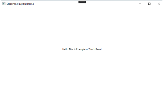
[StackPanel Example Where Orientation = “Horizontal”]
Example of StackPanel Layout where Orientation = “Vertical”: –
<Window x:Class = “GridLayoutDemo.MainWindow”
Xmlns = “http://schemas.microsoft.com/winfx/2006/xaml/presentation”
xmlns:x = “http://schemas.microsoft.com/winfx/2006/xaml”
xmlns:d = “http://schemas.microsoft.com/expression/blend/2008”
xmlns:mc = “http://schemas.openxmlformats.org/markup-compatibility/2006”
xmlns:local = “clr-namespace:GridLayoutDemo”
mc:Ignorable = “d”
Title = “StackPanel Layout Demo” Height = “450” Width = “800”>
<StackPanel Orientation = “Vertical” HorizontalAlignment = “Center” VerticalAlignment = “Center”>
<TextBlock Text = “Hello ” />
<TextBlock Text = “This ” />
<TextBlock Text = “is ” />
<TextBlock Text = “Example ” />
<TextBlock Text = “of ” />
<TextBlock Text = “Stack Panel” />
<TextBlock Text = “.” />
</StackPanel>
</Window>

[StackPanel Example Where Orientation = ” Vertical “]
WrapPanel Layout:
In the WrapPanel, we can set the child element in the same Sequence. WrapPanel has an attribute called Orientation. Using the Orientation property, we can set the element’s Orientation as either Horizontal or Vertical. By default, Wrap Panel’s Orientation value is Horizontal.
Example of WrapPanel Layout where Orientation = “Horizontal”: –
<Window x:Class = “GridLayoutDemo.MainWindow”
Xmlns = “http://schemas.microsoft.com/winfx/2006/xaml/presentation”
xmlns:x = “http://schemas.microsoft.com/winfx/2006/xaml”
xmlns:d = “http://schemas.microsoft.com/expression/blend/2008”
xmlns:mc = “http://schemas.openxmlformats.org/markup-compatibility/2006”
xmlns:local = “clr-namespace:GridLayoutDemo”
mc:Ignorable = “d”
Title = “WrapPanel Layout Demo” Height = “450” Width = “800”>
<WrapPanel VerticalAlignment = “Center”>
<Button x:Name = “btndemo1” Margin = “15” Content = “First Button” />
<Button x:Name = “btndemo2” Margin = “15” Content = “Second Button” />
<Button x:Name = “btndemo3” Margin = “15” Content = “Third Button” />
<Button x:Name = “btndemo4” Margin = “15” Content = “Fourth Button” />
<Button x:Name = “btndemo5” Margin = “15” Content = “Fifth Button” />
<Button x:Name = “btndemo6” Margin = “15” Content = “Sixth Button” />
<Button x:Name = “btndemo7” Margin = “15” Content = “Seventh Button” />
<Button x:Name = “btndemo8” Margin = “15” Content = “Eighth Button” />
<Button x:Name = “btndemo9” Margin = “15” Content = “Ninth Button” />
</WrapPanel>
</Window>

[WrapPanel Example Where Orientation = “Horizontal”]
Example of StackPanel Layout where Orientation = “Vertical”: –
<Window x:Class = “GridLayoutDemo.MainWindow”
Xmlns = “http://schemas.microsoft.com/winfx/2006/xaml/presentation”
xmlns:x = “http://schemas.microsoft.com/winfx/2006/xaml”
xmlns:d = “http://schemas.microsoft.com/expression/blend/2008”
xmlns:mc = “http://schemas.openxmlformats.org/markup-compatibility/2006”
xmlns:local = “clr-namespace:GridLayoutDemo”
mc:Ignorable = “d”
Title = “WrapPanel Layout Demo” Height = “450” Width = “800”>
<WrapPanel Orientation = “Vertical” HorizontalAlignment = “Center”>
<Button x:Name=”btndemo1″ Margin=”15″ Content=”First Button” />
<Button x:Name=”btndemo2″ Margin=”15″ Content=”Second Button” />
<Button x:Name=”btndemo3″ Margin=”15″ Content=”Third Button” />
<Button x:Name=”btndemo4″ Margin=”15″ Content=”Fourth Button” />
<Button x:Name=”btndemo5″ Margin=”15″ Content=”Fifth Button” />
<Button x:Name=”btndemo6″ Margin=”15″ Content=”Sixth Button” />
<Button x:Name=”btndemo7″ Margin=”15″ Content=”Seventh Button” />
<Button x:Name=”btndemo8″ Margin=”15″ Content=”Eighth Button” />
<Button x:Name=”btndemo9″ Margin=”15″ Content=”Ninth Button” />
</WrapPanel>
</Window>

[WrapPanel Example Where Orientation = ” Vertical “]
DockPanel Layout:
A Dock Panel is employed to dock child parts in the relative parts’ left, right, top, and bottom positions. The position of child parts is decided by the Dock property of the respective child parts and the relative order of those child elements. By default, the value of the Dock property is left. The Dock property is of the sort Dock enumeration that has Left, Right, Top, and Bottom values.
Example of DockPanel Layout: –
<Window x:Class = “GridLayoutDemo.MainWindow”
Xmlns = “http://schemas.microsoft.com/winfx/2006/xaml/presentation”
xmlns:x = “http://schemas.microsoft.com/winfx/2006/xaml”
xmlns:d = “http://schemas.microsoft.com/expression/blend/2008”
xmlns:mc = “http://schemas.openxmlformats.org/markup-compatibility/2006”
xmlns:local = “clr-namespace:GridLayoutDemo”
mc:Ignorable = “d”
Title = “DockPanel Layout Demo” Height = “450” Width = “800”>
<DockPanel>
<Button x:Name = “btndocktop” Content = “Top” Height = “50” DockPanel.Dock = “Top” />
<Button x:Name = “btndockright” Content = “Right” Width = “50” DockPanel.Dock = “Right”/><Button x:Name = “btndockbottom” Content = “Bottom” Height = “50” DockPanel.Dock = “Bottom”/>
<Button x:Name = “btndockleft” Content = “Left” Width = “50” DockPanel.Dock = “Left” />
<Button x:Name = “btndockcenter” Content = “Center” />
</DockPanel>
</Window>
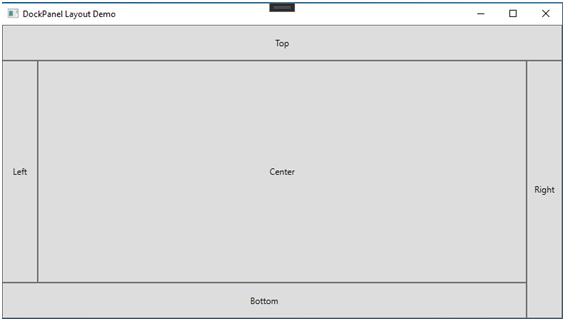
[DockPanel Example]
Canvas Panel Layout:
A Canvas panel is employed to position child elements by using coordinates relative to the canvas area. Here are a number of the properties of Canvas panels. By default, the values of the Height and Width properties of a Canvas are 0. Remember that you must set these values in order to view a canvas; otherwise, child components must be made auto-resizable.
- Child parts on a Canvas are never resized.
- The vertical and horizontal alignments on child parts don’t work. Child parts are placed on positions set by the Canvas’s Left, Top, Right, and Bottom properties.
- The margin does work partially. If the Left property of Canvas is set, the Right property doesn’t work. If the Top property of Canvas is set, the bottom property doesn’t work.
Example of CanvasPanel Layout: –
<Window x:Class = “GridLayoutDemo.MainWindow”
Xmlns = “http://schemas.microsoft.com/winfx/2006/xaml/presentation”
xmlns:x = “http://schemas.microsoft.com/winfx/2006/xaml”
xmlns:d = “http://schemas.microsoft.com/expression/blend/2008”
xmlns:mc = “http://schemas.openxmlformats.org/markup-compatibility/2006”
xmlns:local = “clr-namespace:GridLayoutDemo”
mc:Ignorable = “d”
Title = “CanvasPanel Layout Demo” Height = “450” Width = “800”>
<Canvas>
<Ellipse x:Name = “cneldemo1” Canvas.Left = “210” Canvas.Top = “10” Height = “200” Width = “200” Stroke = “Black” StrokeThickness = “5” Fill = “RED” />
<Ellipse x:Name = “cneldemo2” Canvas.Left = “240” Canvas.Top = “40” Height = “200” Width = “200” Stroke = “Black” StrokeThickness = “5” Fill = “Orange” />
<Ellipse x:Name = “cneldemo3” Canvas.Left = “270” Canvas.Top = “70” Height = “200” Width = “200” Stroke = “Black” StrokeThickness = “5” Fill = “YELLOW” />
<Ellipse x:Name = “cneldemo4” Canvas.Left = “300” Canvas.Top = “100” Height = “200” Width = “200” Stroke = “Black” StrokeThickness = “5” Fill = “GREEN” />
<Ellipse x:Name = “cneldemo5” Canvas.Left = “330” Canvas.Top = “130” Height = “200” Width = “200” Stroke = “Black” StrokeThickness = “5” Fill = “BLUE” />
<Ellipse x:Name = “cneldemo6” Canvas.Left = “360” Canvas.Top = “160” Height = “200” Width=”200″ Stroke = “Black” StrokeThickness = “5” Fill = “INDIGO” />
<Ellipse x:Name = “cneldemo7” Canvas.Left = “390” Canvas.Top = “190” Height = “200” Width = “200” Stroke = “Black” StrokeThickness = “5” Fill = “VIOLET” />
<Ellipse x:Name = “cneldemo8” Canvas.Left = “525” Canvas.Top = “240” Height = “40” Width = “40” Stroke = “Black” StrokeThickness = “5” Fill = “Black” />
<Ellipse x:Name = “cneldemo9” Canvas.Left = “420” Canvas.Top = “240” Height = “40” Width = “40” Stroke = “Black” StrokeThickness = “5” Fill = “Black” />
<Ellipse x:Name = “cneldemo” Canvas.Left = “457” Canvas.Top = “325” Height = “30” Width = “70” Stroke = “Black” StrokeThickness = “5” Fill = “Black” />
</Canvas>
</Window>

[CanvasPanel Example]
Conclusion:
Creating a UI in WPF is very similar to Angular application development, however, the approach makes the difference. WPF makes use of layouts for UI design. This blog has covered the various layouts of WPF and its code example which will hopefully help you to understand how it works. Although there is much more to cover about this layout in-depth that shall cover in single layout blogs. It is an essential topic to understand Design in WPF.